
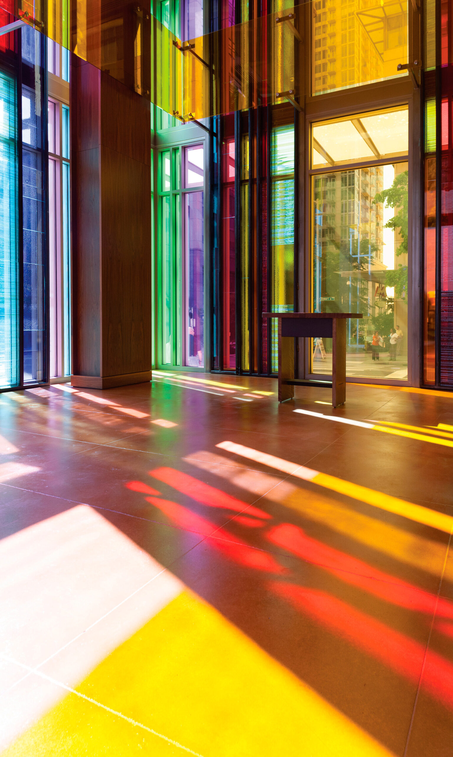
Color in Context at the Gethsemane Lutheran Church
Designed as a beacon of light by Olson Kundig, Gethsemane Lutheran Church is a vivid reimagining of sacred space in an urban environment.
In a dense neighborhood in downtown Seattle, Gethsemane Lutheran Church—a 62,135-square-foot sanctuary with a mid-century facade—is ecstatic in its light and design. Along with helming the remodel of the building’s exterior and the church’s main sanctuary, prominent Pacific Northwest design practice Olson Kundig also designed the chapel, garden, and Parish Life Center. The firm used color and glass to communicate the church’s mission while establishing a clear identity for a building.
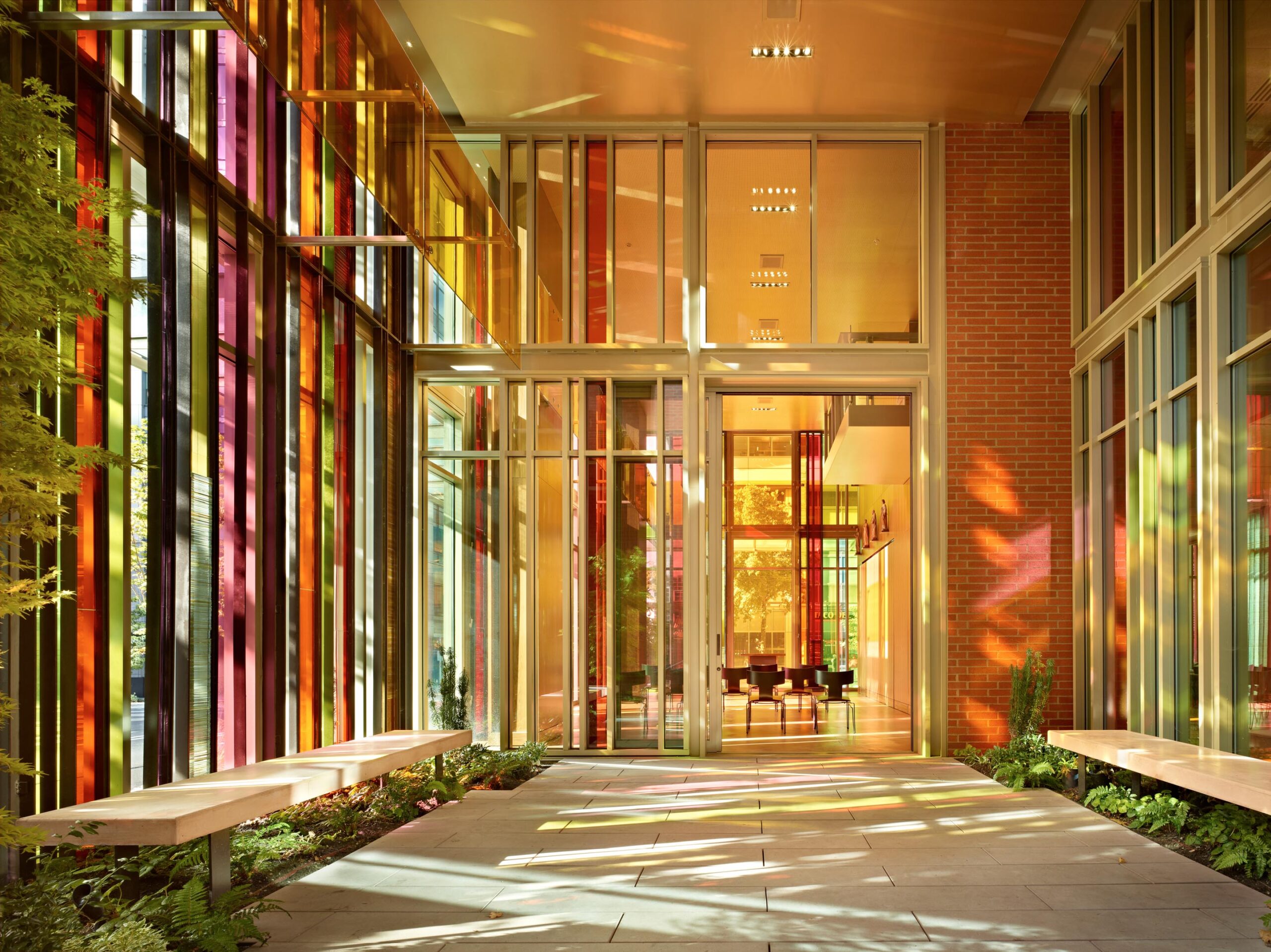
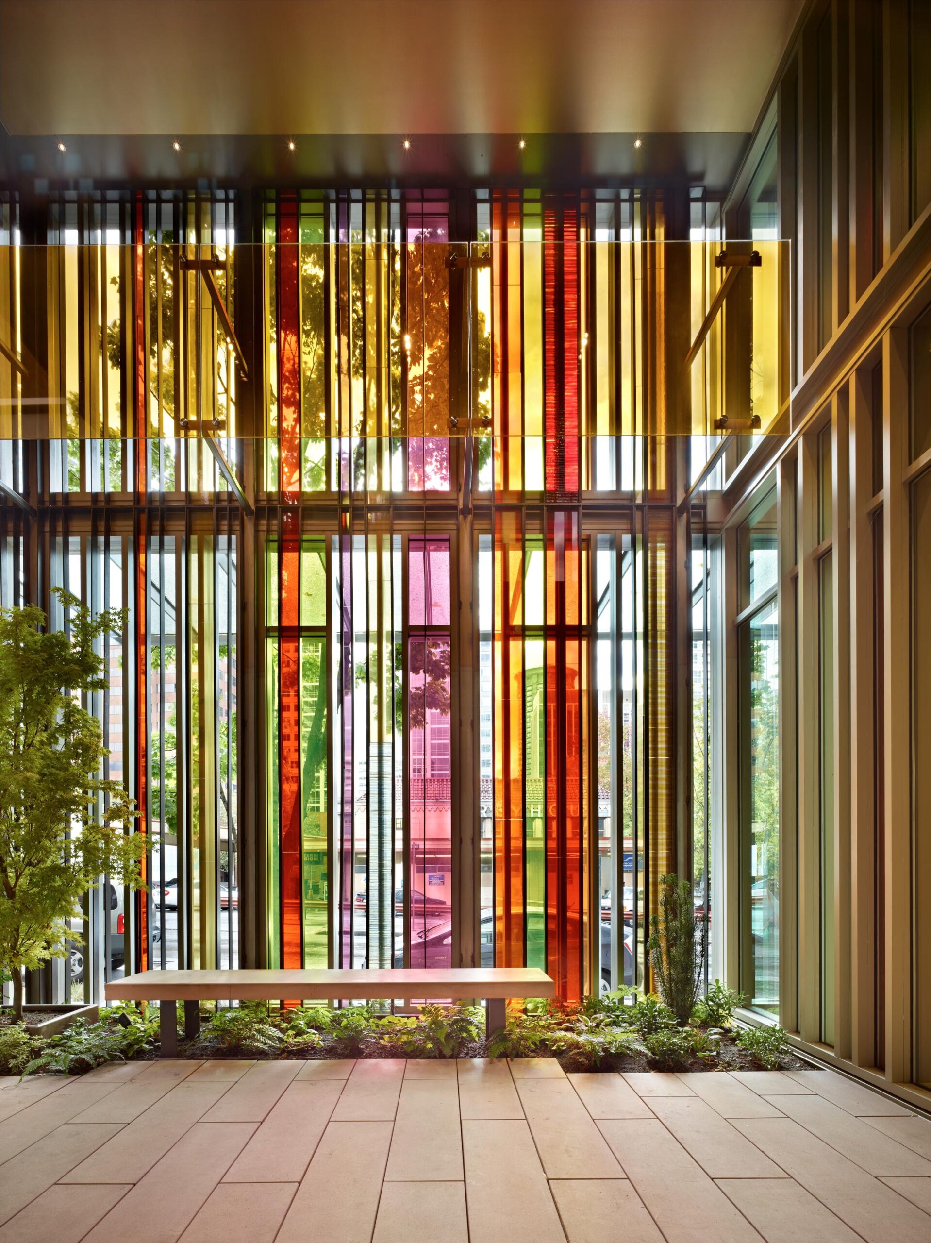
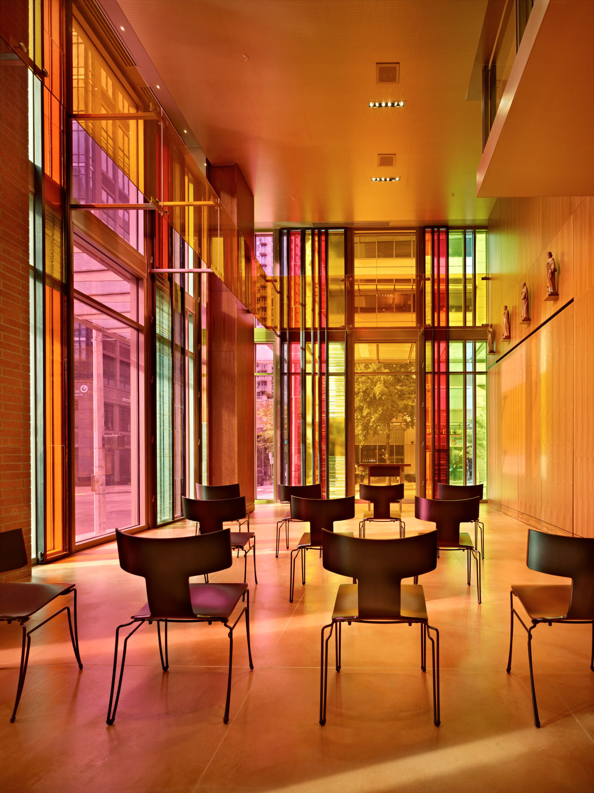
That color is the main protagonist of the project is a fitting tribute to a typology known for its vivid ecclesiastical scenes in time-honored stained glass. In this case, “The colored metal and glass bands are intended to weave together the various building parts—sacred spaces and church facilities, with housing and social services above—into a visual tapestry,” says Jim Olson, FAIA, principal/owner of Olson Kundig.
“The concept is a bit like a large woven basket, gathering and connecting people together as religion often does. The wash of color across the interior when the sun shines through the glass is a similar effect to traditional stained glass, but much more transparent and open to the city.”
With warm tones of the chapel’s handcrafted glass windows casting a quiet natural light onto the street, a small meditation garden adjoins the chapel and fellowship hall, “balancing openness with outreach,” as the practice puts it. The result is something quite vibrant for a place we thought we knew: a modern design that breaks with tradition while honoring it too. olsonkundig.com
Photo: courtesy of Chris Burnside & Benjamin Benschneider
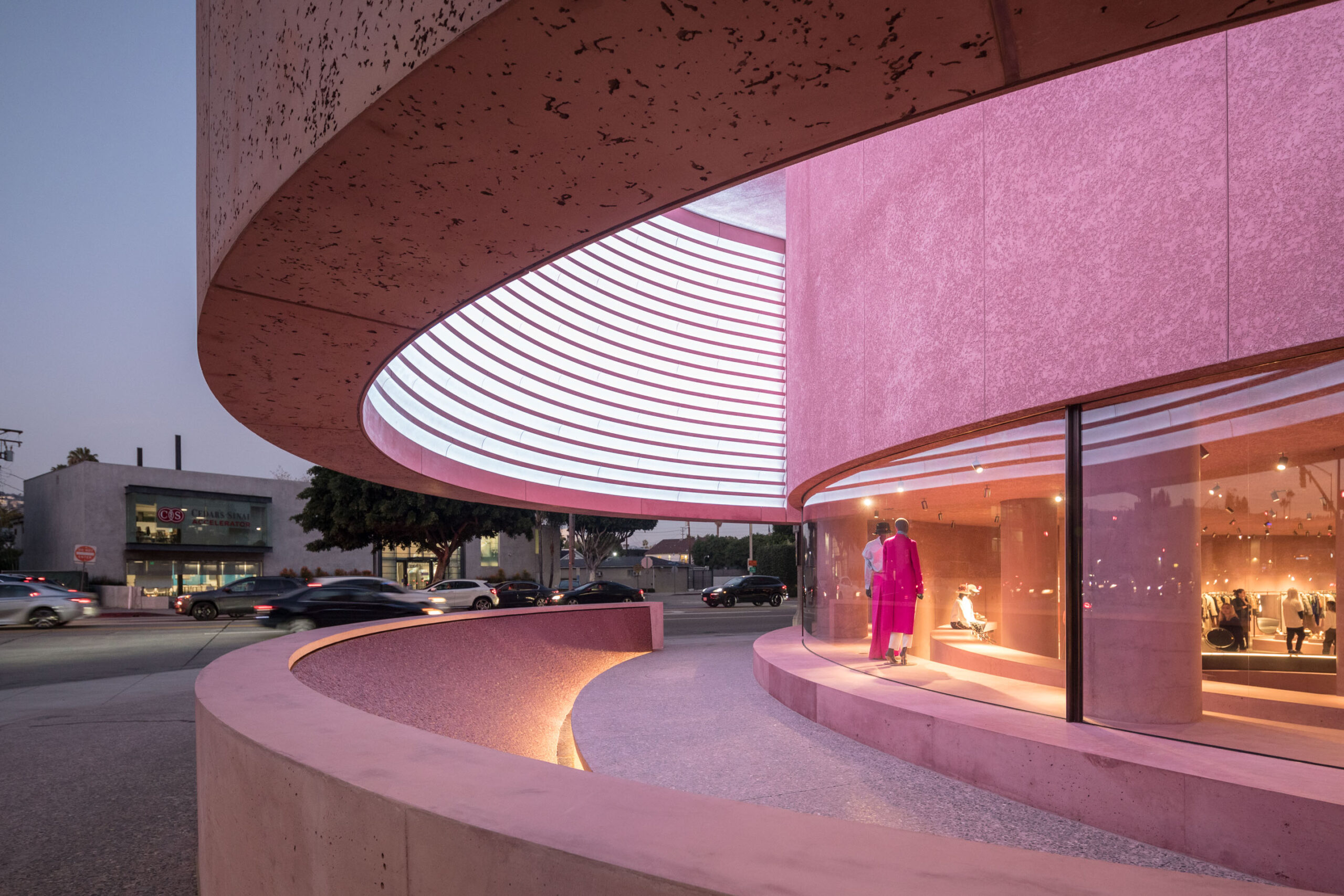
A Softer Tone of The Webster
An homage to the luminosity of California, a pink-tinted façade marks The Webster—David Adjaye’s first foray in Los Angeles.
The latest in a series of works by architect Sir David Adjaye OBE that experiments with material and pink pigment, The Webster’s flagship in L.A., set at the base of the Beverly Center, is a curvaceous concrete form injected with a pink dye that softens the brutalist-style building above it. “Pink felt like fashion, but I wanted to make something that was tough and gentle at the same time,” said David Adjaye, in an interview with Surface Magazine.
Designed to be more of a public space, the 11,000-square-foot structure might feel too much the monolith without the plethora of incandescent pink inside and out. David Adjaye selected the hue for its appeal to the Pacific sensibility and specifically how the light in California naturally enhances saturated colors, and this choice gives the form an artful edge while asserting itself as an urban oasis with a shorter, curved concrete wall that can be utilized as a bench facing away from the structure. Fronted by a long glass window, the building opens itself up to onlookers but retains the intimacy and spatial elegance within.

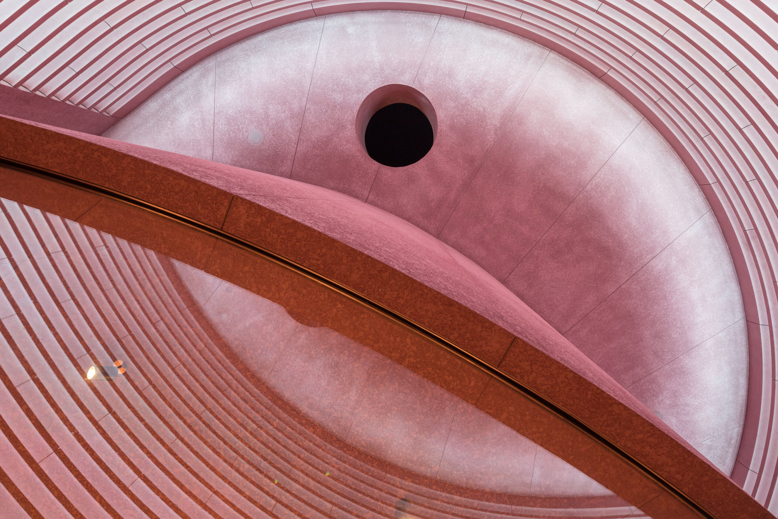
Inside, the permeation of pink is near total, complemented by a terrazzo floor topped with grayish concreted and chips of marble, along with glints of bronze-framed mirrors and other fittings that infuse the space with just-enough luster. In The Webster—Adjaye Associates’ first project in L.A. and a bit of a budding landmark at that—pink proves itself not only amenable to the architecture of a particular physicality but the most ideal of its amplifiers. adjaye.com
Photos: Courtesy of Laurian Ghinitoiu

High-Energy Hues
Thiel Architecture + Design uses judicious hits of crayon-box color to highlight a collaborative workspace near Union Square in New York City.
Intense pops of primary color define the NYC headquarters for creative branding company COLLINS. The exuberant 6,000-square-foot space, with a central library area, is a credit to the equally dynamic design team at Thiel Architecture + Design, principals Nancy Thiel and Julie Hanselmann Davies.
“As an internationally recognized branding guru, our client is first and foremost a graphic designer,” says architect and interior designer Nancy Thiel, noting his colorful personality. “We wanted to express that in the design and find surprising ways to reveal the color.” Not everywhere, and not all at once, but strong and saturated when used.
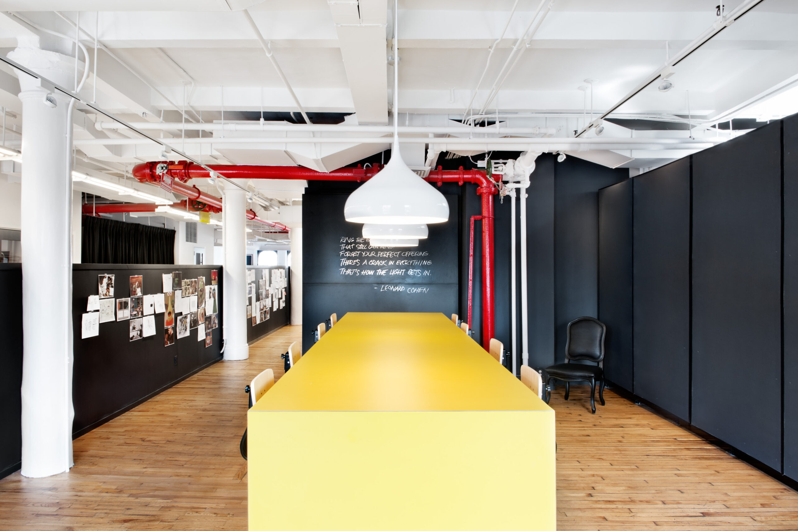
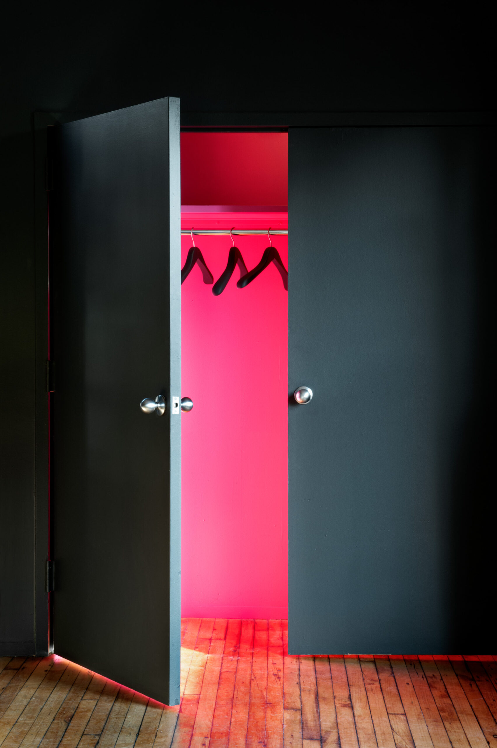
“Every project has its own approach to the use of color,” Thiel intones. “In this project, where the bones of the design are black and white, we used bold, bright colors to punch through and accentuate various elements. A sofa here, a table there, the walls of the bathrooms. We just went for it.” From vivid furnishings—a bright yellow work table, blue sofa, fuchsia stool—to black chalkboard walls, to a conference room ceiling painted in
Benjamin Moore Orange that Nancy Thiel describes as “a powerful and creative color that adds such positive energy to the space without being overbearing.” Of these here-and-there hues, she confesses, “I love the hot pink in the coat closet!”
These energetic tones are a good match for a space designed as a collaborative environment with meeting and work areas, and a showcase for CCO Brian Collins’ collection of books, vintage toys, mid-century furnishings, and more. It’s fun and fearless. thieldesign.com
Photos: Courtesy of Emily Andrews


